A Windows Forms control is a class that derives directly or indirectly from System. Windows. Forms. Control. The following list describes common scenarios for developing Windows Forms controls.
The base class for Windows Forms controls, System.Windows.Forms.Control, provides the plumbing required for visual display in client-side Windows applications. Control provides a window handle, handles message routing, and provides mouse and keyboard events as well as many other user interface events. It provides advanced layout and has properties .specific to visual display, such as ForeColor, BackColor, Height, Width, and many others. Additionally, it provides security, threading support, and interoperability with ActiveX controls. Because so much of the infrastructure is provided by the base class,· it is relatively easy to develop your own Windows Forms. controls.
The Windows Forms controls are listed here according to general function you can find all of these controls in the ToolBox.
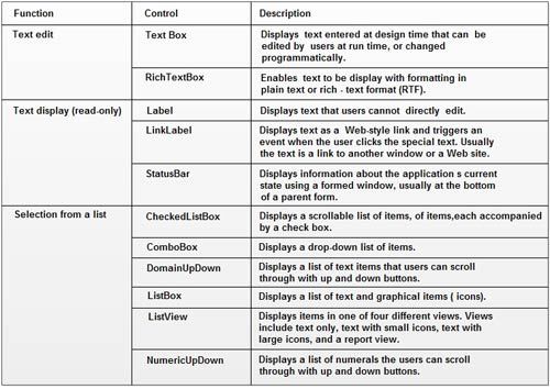
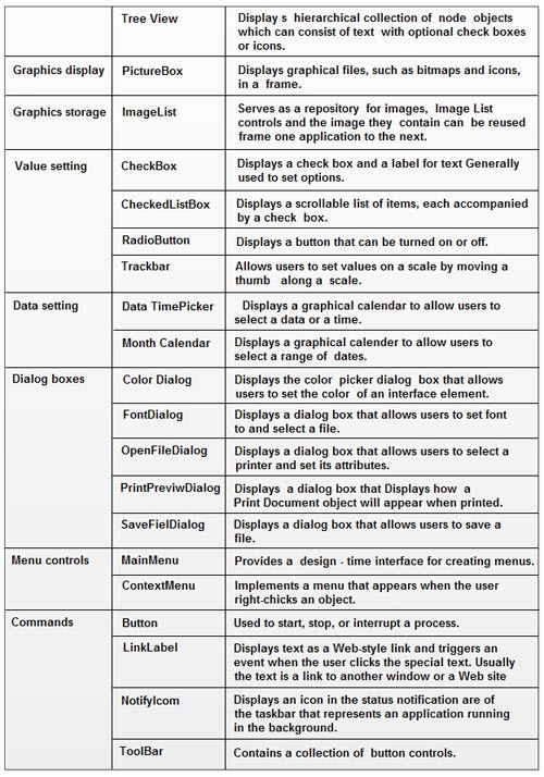
Explaining all of the controls present in visual studio is impossible within the scope of this book, but some· most important controls are described in the next few sections.
We’ll be covering the following topics in this tutorial:
Button
The Windows Forms Button control allows the user to click it to perform an action. The Button control· can display both text and images. When the button is clicked, it looks as if it is being pushed in and released.
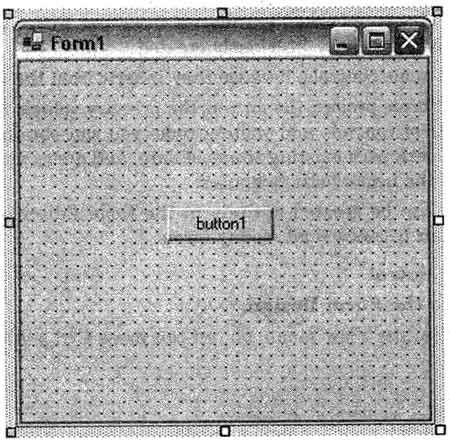
Whenever the user clicks a button, the Click event handler is invoked. You place code in the Click event handler to perform any action you choose.
The text displayed on the button is contained in the Text property. ·If your text exceeds the width of the button, it will wrap to the next line. However, it will be clipped if the control cannot accommodate its overall height. The Text property can contain all. access key, which allows a user to “click” the control by pressing the ALT key with the access key. The appearance of the text is controlled by the Font property and the TextAlign property. The Button control can also display images using the Image and ImageList properties. The most basic use of a Windows Forms Button control is to run some code when the button is clicked.
Clicking a Button control also generates a number of other events, such as the MouseEnter, MouseDown, and MouseUp events. If you intend to attach event handlers for these related events, be sure that their actions do not conflict. For example, if clicking the button clears information that the user has typed in a text box, pausing the mouse pointer over the button should not display a tool tip with that now-nonexistent information.
If the user attempts to double-click the Button contr91, each click will be processed separately; that is, the control does not support the double-click event.
How to respond to a button click
To assign an action on the button control write the following code in the button’s Click event handler or double click on the button in design mode it will directly transfer you to click event handler. The code written’ in handler will display a message box which will show Button1 was clicked” message.
Example:
private void button1-click(object sender, System.EventArgs e),
{
MessageBox.show(“button1 was clicked”);
}
Check Box
The Windows Forms CheckBox control indicates whether a particular condition is on or off. It is commonly used to present a Yes/No or True/False selection to the user. You can use, check box controls in groups to display multiple choices from which the user can select one or more
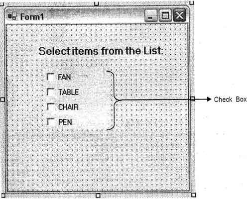
The check box control is similar to the radio button control in that each is used to indicate a selection that is made by the user. They differ in that only one radio button in a group can be selected at a time. With the check box control, however, any number of check ‘boxes may be selected.’
A check box may be connected to elements in a database using simple data, binding.
Multiple check boxes may be grouped using the GroupBox control This is useful for visual appearance and also for user interface design, since grouped controls can be moved around together on the form designer.
The CheckBox control has two important properties, Checked and CheckState. The
Checked property returns either true or false. The CheckState property returns either
CheckState Checked or CheckState.Unchecke1d or, if the ThreeState property is set to true, CheckState may also return CheckState in determinate. In the indeterminate state, the box is displayed with a dimmed appearance to indicate the option is unavailable.
Whenever a user clicks a Windows Forms Check Box control, the Click event occurs. You can program your application to perform some action depending- upon the state of the check box.
How to respond to CheckBox clicks
To assign an action on the CheckBox control write the following code in the CheckBox’s
Click event handler. The code written in handler of checkBox control will change Text property each time the control is clicked, indicating a checked or unchecked state.
private void checkBox1_click(object sender, System. EventArgs e)
{
if (checkBox1.checked)
{
checkBox1. Text + = “checked”;
}
else
{
checkBox1.Text += ” Unchecked’
}
}
Label
Windows Forms .Label controls are used to display text or images that cannot be edited by the user. They are used to identify objects on a form – to provide a description of what a certain control will do if clicked, for example, or to display information in response to a runtime event or process in your application. For example, you can use labels to add descriptive captions to text boxes, list boxes, combo boxes, and so on. You can also write code that changes the text displayed by a label in response to events at run time. For example, if your application takes a few minutes to process a change, you can display a processing-status message in a label.
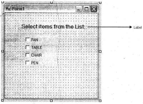
The caption displayed in the label is contained in the Text property. The Alignment property allows you to set the alignment of the text within the label.
TextBox
Windows· Forms text boxes are used· to get input from the user or to display text. The textBox control is generally used for editable text, although it can also be made read-only. Text boxes can display multiple lines, wrap text to the size of the· control, and add basic formatting. The TextBox control provides a single format style for text displayed or entered into the control. To display multiple types of formatte4 text, use the RichTextBox control.
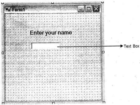
The text displayed by the control is contained in the Text property. By default,’ you enter up to 2048 characters in a text box. If you set the Multiline property to true, you enter up to 32 KB of text. The Text property can be set at( design time with the Properties window, at run time in code, or by user input at run time. The current contents of a text be! can be retrieved at run time by reading the Text property ..
The code below sets text in the control at run time. The InitializeMyCoutrol procedure will not execute. automatically it must be called
private void InitializeMycontrol()
{
I I Put some text into the contro1 first .
textBox1.Text = “Thi5 . is a TextBox control,,”;
}
To create a password text box
A password box is a Windows Forms text box that displays placeholder’ characters a user types a string.
1. Set the PasswordChar property of the TextBox control to a specific character. The PasswordChar. property specifies the character displayed in the text box. example, if you want asterisks displayed in the password box, specify * for the PasswordChar property in the Properties window. Then, regardless of what character a user types in the text box, an asterisk is displayed.
2. (Optional) set the MaxLength property. The property determines how many characters can be typed in the text box. If the maximum length is exceeded, the system, emits beep and the text does not accept any more characters. Note that you may not wish to do this’ as the maximum length of a password may be of use to hackers who are trying to guess the password.
The code below initializes a text box that will accept a string up to 14 characters long and display asterisks in place of the string. The InitializeMyControl procedure will not execute automatically; it must be called.
private void InitializeMycontrol()
{
II Set to no text.
textBox1.Text = “”;
II The password character is an asterisk.
textBox1~passwordchar = ‘*’;
II The control’ will allow no more than 14 characters.
textBox1.MaxLength= 14;
}
ComboBox
The Windows Forms ComboBox control is used to display data in a drop-down combo Box. By default, the ComboBox control appears’ in two parts: the top part is a text box allows the user to type a list item. The second part is a list box: that displays a list of item from which the user can select one.
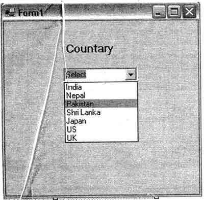
The Selectedlndex property returns an integer value that corresponds to the selected list item. You can programmatically change the-selected item by changjng the Selectedlndex value in code; the corresponding item in the list will appear in the text box portion of the combo box. If no item is selected, the Selectedlndex value is -1. If the-first item in the list is selected, then the Selectedlndex value is o. The Selectedltem property is similar to Selectedlndex, but returns the item itself, usually a string value. The Items.Countproperty reflects the number of items in the list, and the value of the Items.Count property is always one more than the largest possible Selectedlndex value because Selectedlndex Is zero-based.
 Dinesh Thakur holds an B.C.A, MCDBA, MCSD certifications. Dinesh authors the hugely popular