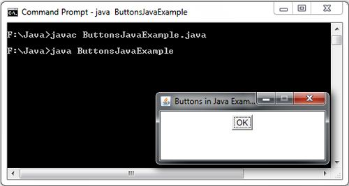
Buttons are perhaps the most familiar of all the component types. It is a regular push button that can contain text. It can be created by instantiating the Button class. The text on the face of the button is called button label. The buttons, components encapsulated in java.awt.Button class are as panels labeled with a text that, when activated, can trigger the execution of a routine or sequence of commands. Whenever a push button is clicked, it generates an event and executes the code of the specified listener. A button can be created using the following syntax:
Button button=new Button( );
Button button=newButton(String button name);
Button objects provide the most basic (and most commonly used bi-state controls in the AWT. They are generally labeled with SUBMIT, YES, ACCEPT, NO, or other simple one- or two word messages. Very seldom are AWT Buttons sub classed in a normal application.
A Button is added to a Container object (usually a Panel or a descendant of Panel) and is then said to be contained or owned by the Panel. The event handler for the Panel is normally considered to be responsible for any actions upon the Button.
Button Useful Interface
Metohod | Returns | Notes |
Button |
| |
Button(String label) | An empty Button is somewhat unusual, but possible | |
getLabel() | String | What’s on the Button right now? |
setLabel(String label) | Void | Paint a new text string in same Button; this implies a layout manager relayout |
import java.awt.*;
 class ButtonExample extends Frame
 {
      ButtonExample()
      {
          setLayout(new FlowLayout());
          Button btnOK = new Button("OK");
          add(btnOK);
      }
 }
     class ButtonsJavaExample
    {
        public static void main(String args[])
       {
            ButtonExample frame = new ButtonExample();
            frame.setTitle("Buttons in Java Example");
            frame.setSize(250,100);
            frame.setResizable(false);
            frame.setVisible(true);
      }
    }

 Dinesh Thakur holds an B.C.A, MCDBA, MCSD certifications. Dinesh authors the hugely popular