Excel graph provides us a great feature to represent spreadsheet data in a graphical manner. Graphs are not detail method to represent data but it is a solid way to represent it.
‘Chart’ is a MS Excel tool to visualize the data in an easy and simple manner. Chart option in MS excel provide us many categories like Column, Line, Pie, Bar, Area, Scatter etc. To represent data in different-different pictorial form.
When we insert chart, more tab appear on menu bar like DESIGN, LAYOUT, and FORMAT.
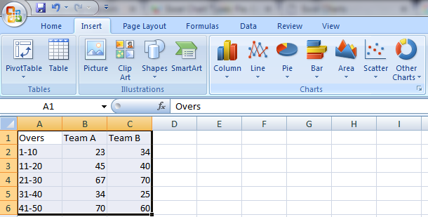
To understand the chart properly, let us discuss an excel graph example of 50 over cricket match. Both teams are scoring runs in match. Using chart we can show the difference of both team score very easily.
How to Convert Spreadsheet data in Chart form?
1) Enter data in excel sheet.
2) Select the entire rows and columns having entered data.
3) Now click on Home>Chart. Select Line chart option to represent data. 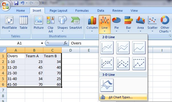
4) If you don’t want to represent data in line chart option then you can click on All Chart Types option to use many more types of charts.
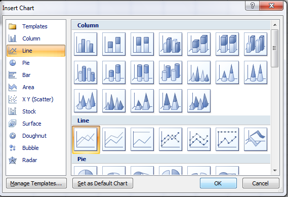
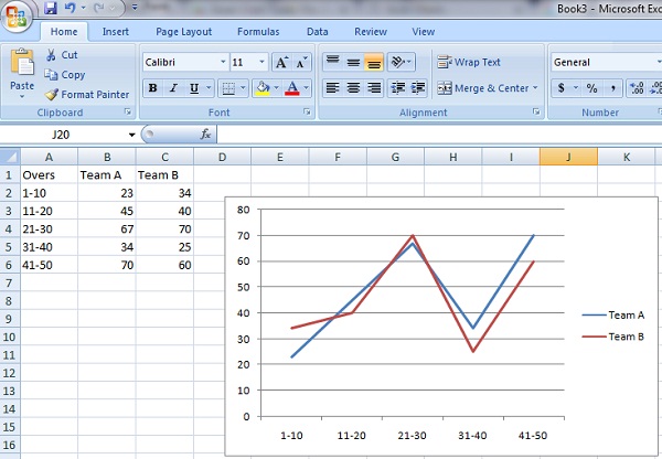
5) After clicking on line option. Chart will appear on screen.
Naming of Horizontal and Vertical Axis in excel graph:
In above figure, Axis representing overs there known as Horizontal axis.
Axis representing scores in interval of 10 is known as Vertical axis. To assign the naming to axis.
1) First select the graph. It is important, If you not select the graph Layout, Design and Format chart tools option will not appear to you.
2) Now click on Layout>Labels>Axis Titles. A dialog box ill appear to you.
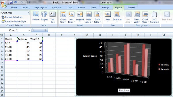
3) When you click on Title below Axis, a text box on horizontal axis will show to you. Change the text value according to your requirement and press enter.
4) Similar procedure will follow for vertical axis. Now click on Primary Vertical Axis Title .A long list option will appear in front of you. Just click on one option. And give title.
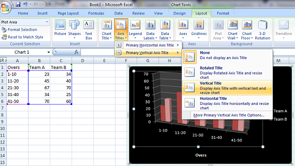
How to Change excel graph Chart type?
After inserting chart, we can easily change the type of a chart.
1) Click on Design >Change Chart Type option in type group.
2) A Change Chart Type dialog box will appear showing many categories.
3) Select Clustered column and press ok. Line chart convert into clustered column chart.
4) Chart Styles option of clustered group shows us many color combination of Clustered column. 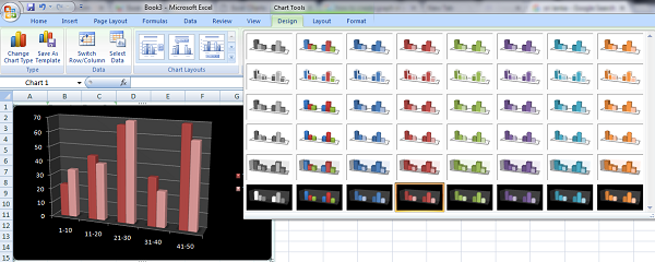
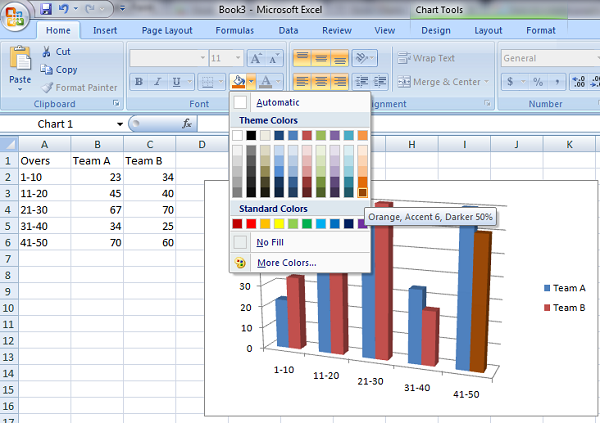
5) We can also change the color of single bar. Click on Single bar of chart.
Click on Home > Font > Fill Color. A dialog box appear .Select the color from standard colors.
How to change Background of excel graph Chart?
1) Select chart lying on excel sheet.
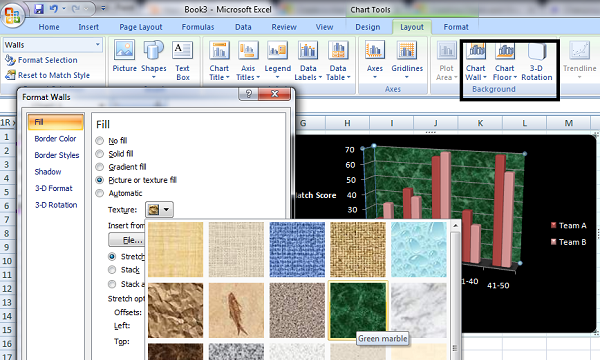
2) Click on layout > Chart Wall option from Background group.
3) Format walls dialog box appear. On left side of box many options are showing us. Select Fill options.
4) From Many options,choose Texture list. Select a texture and click on ok.
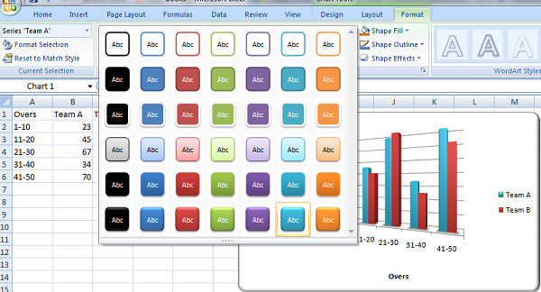
2) Choose different styles from drop down list.
How to reset Legend in excel graph chart:
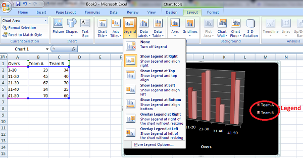
Legends are the label of bars like Team A, Team B. When we create a chart they are showing on right side .To change the side
1) We have to click on Layout > Legend in Labels group.
2) When we click on Arrow a list will appear and showing many options.
3) Select Show legend left option.
Changing Row into Column and Column into row
To switch row and column, Click on Design >Switch row/column option data group.
1) Horizontal axis is representing overs and vertical axis representing score. Like Showing in figure:
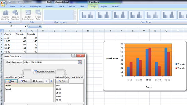
When we click on switch option .Vertical and Horizontal axis get interchange.
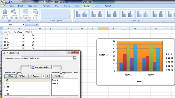
Now team A and Team B is representing horizontal axis.
Chart provide many tools like:
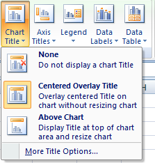
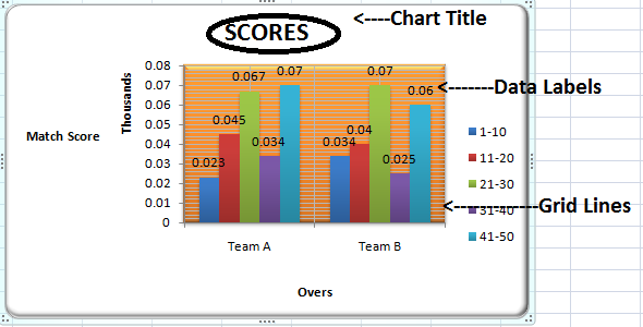
Chart Title: This option is used to give title to chart. When we click on chart title arrow. Option appear as showing below. We can also change the format of title like font, color, rotation click on more Title Option.
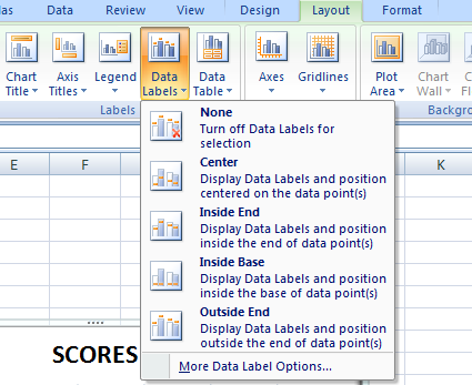
Data Labels– Data labels show the excel sheet value on bar.
To apply this option click on Layout >Data Labels in labels group.
Gridlines option create lines in variation at background. In horizontal or vertical option.
 Dinesh Thakur holds an B.C.A, MCDBA, MCSD certifications. Dinesh authors the hugely popular